I’m a designer based in Barcelona, previously several years in London and an MA in Digital Experience Design....

I've designed and collaborated on visual identities and digital products across fields ranging from skateboarding and biotech to luxury fashion and contemporary art. Today, I craft design solutions that are purposeful, sustainable, and current.

Alongside, I capture moments through photography, engage with contemporary art, while critically reflecting on technology's impact on tomorrow and my responsibilities as a designer.

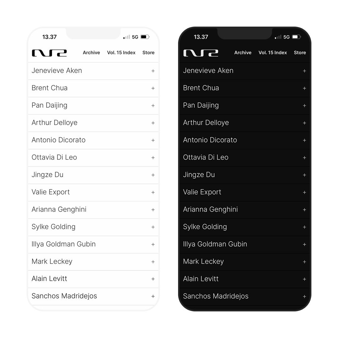
Fig. 1
NR Index dark/light mode
Fig. 2

From concept to delivery: high-impact, low-carbon web design

Sector
Fashion · Arts · Magazines · Publishing
Service
Digital design · eCommerce · UX design · 3D
Tool
Pen & paper · Wordpress · Adobe (Ps Ai Ru) · Blender
Fig. 1
2022 · Mobile: index page, light/dark theme
Fig. 2
2022 · Desktop: video outtake

The fashion and culture outlet NR Magazine, then based in London and Milan, commissioned me to redesign their website, to strengthen and modernise their online presence and search visibility.

Over time, their site had become slow and was poorly indexed, was ranking low in search results with extracts of random information. After in-depth investigation, I identified inaccessible copy and heavy media as key factors, altogether limiting performance and discoverability.

Drawing on research showing that younger audiences value sustainability-minded brands, I proposed a strategy to rebuild the site on the platform of digital sustainability; improving SEO, accessibility, and user experience in one package. The new responsive site encompassed over 300 pages and 2,900 optimised quality images, using open-source CMS, scalable and future-proof technology, with broad integration possibilities. It also introduced adaptive light/dark modes and a lightweight, energy-efficient framework – and a webshop.

Shortly after launch, NR Magazine ranked in top search results consistently, even when searching individually for featured artists. The redesigned site loaded instantly across devices, achieved top SEO and carbon-efficiency scores, while reflecting a progressive editorial vision. Google's score at the time of the sites release:

  • SEO 100%
  • Best Practices 100%
  • Accessibility 100%

Get more project info

Fig. 4
NR logo black

Emerging from the intersection of sand dunes, ink drawing, and Hi-Fi

Sector
Fashion · Arts · Magazines · Publishing
Service
Logo Design · Creative Direction · 3D
Tool
Pen & paper · Adobe (Ai) · iOS Notes · Blender
Fig. 3
2021 · NR logo, outlined
Fig. 4
2021 · NR logo

Assigned with the task to design the logo for the bi-annual NR magazine for its 14th issue, I dived in using a responsive and transparent design process, in close engagement with the editors.

To reflect the magazine's embracing and cross-genre nature, rooted in fashion, music and culture, I arrived at an aesthetic intersecting graphics, semiotics and iconography from Hi-Fi and analog video systems. Timeless, resilient, and versatile, the logo debuted on the cover with the actor Willem Dafoe, featuring artists Naomi Gilon, Ed Templeton and more.

View in 3D motion
Behind the design process

Fig. 6
FUTURE logo black

Versatile, timeless logo, and online photo-centered showcase

Sector
Model management · Luxury Fashion
Service
Logo Design · Typography · Web design
Tool
Pen & paper · Adobe (Ai)
Fig. 5
2021 · FUTURE logo, outlined
Fig. 6
2021 · FUTURE logo

Positioned in the luxury fashion space, seeking a minimalist and powerful identity, FUTURE approached me to design their logo and a website showcasing select creative projects for their clients counting known luxury fashion houses.

Collaborating closely with the founders, we developed a bold, characterful custom font that captures the agency’s refined but contemporary edge. The accompanying website was designed to showcase a curated selection of FUTURE’s high-end fashion photography. It features a dynamic light/dark mode that responds seamlessly to the visitor’s system preferences, enhancing both usability and feel.

Fig. 8
Pataphysic logo shadow

Concept-led logo and gallery-run online destination

Sector
Arts · Art galleries
Service
Logo Design · Creative Direction · Web design
Tool
Pen & paper · Adobe (Ai)
Fig. 7
2020 – 2021 · Pataphysic, twirl
Fig. 8
2020 – 2021 · Pataphysic, shadow

Adaptable to any size and medium, I designed Pataphysics logo, a digital platform for artists, organised by Anthony Reynolds Gallery in London.

Pataphysics was a term coined by French surrealist Alfred Jarry as a spoof on science. The symbol for the movement became a circular spiral – hence a spiral forming two P’s inside one another. In addition, I was asked to design a website in memory of one of UK's first media artists with photo archives supplied by Tate Gallery.

Fig. 9
NEW Aesthetic custom display typography
Fig. 10
Free Flow custom display typography

Survey into the digital transformation of contemporary arts

Sector
Arts · Technology
Service
Typography · UX Research · UX Design
Tool
Pen & paper · Adobe (Ai)
Fig. 9
2017 – · Display type: 'New', 'Aesthetic'
Fig. 10
2017 – · Display type: 'Free Flow'

Through the lens of digital UX design, my MA thesis explores the digital transformation of the contemporary art gallery.

Featuring interviews with amongst others Curator and Director of The Hayward Gallery Ralph Rugoff, and Curator, PhD Software Curating, Joasia Krysa, the research project evolved into a dialogue representing diverse views, eventually shifting initial assumptions through complex challenges and towards new and unexpected concepts. To complement the themes that surfaced from an in-depth research phase, I designed a number of bespoke display fonts. The project was designed to develop post deadline and in progress.

Get more project info