- Fig. 1
- Ink and pencil on paper · Early exploration
- Fig. 2
- Ink on paper · Forms emerging
Case study – NR logo design
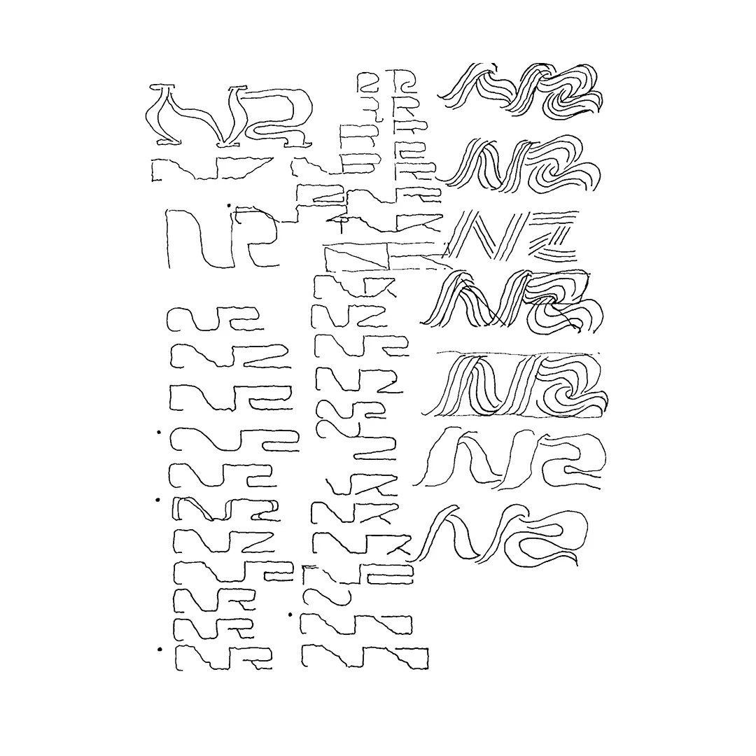
I was approached to design a new logo for NR magazine. The process began with hand-drawn sketches and structural explorations, moving gradually into vector studies. Below is a selection of work developed through London public transport rides, late-night studio sessions, and close dialogue with the editors. The resulting identity balances intuition and system, reflecting NR’s position at the intersection of fashion, music, and contemporary culture.
Fig. 1
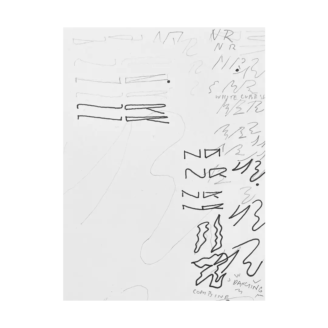
Fig. 2
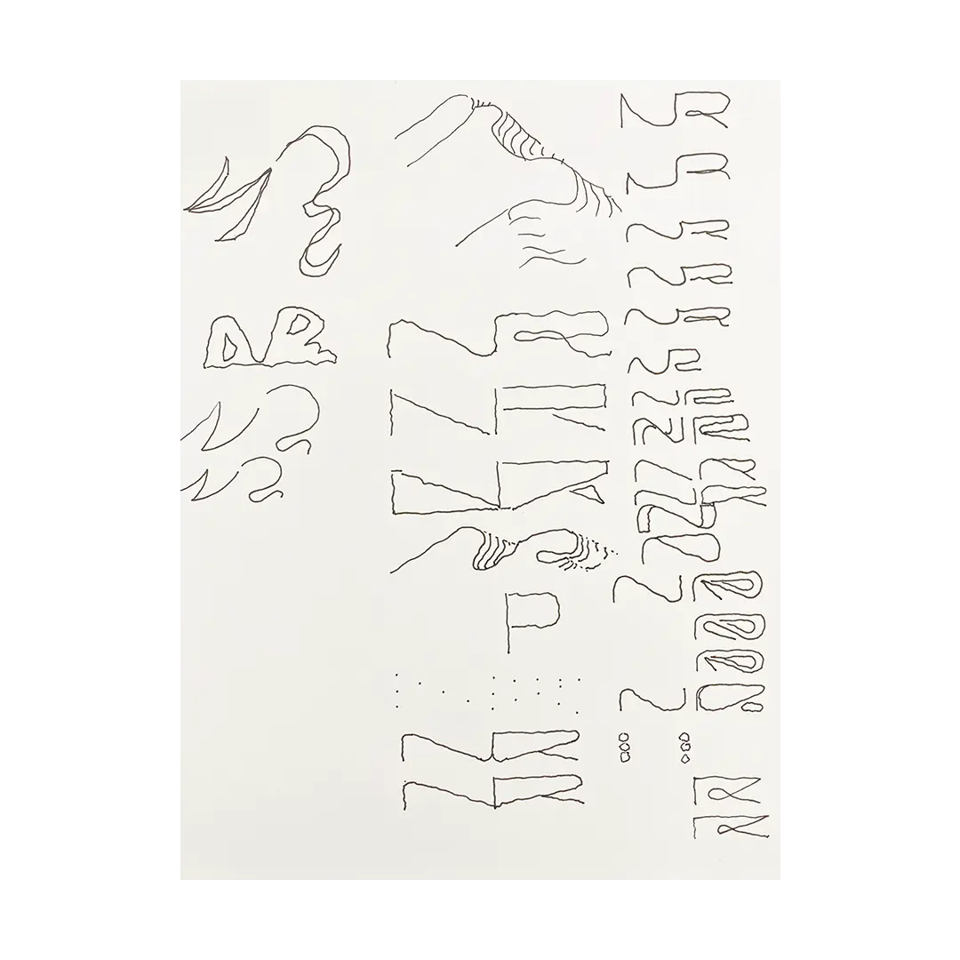
Fig. 3
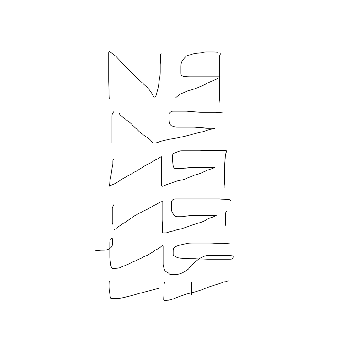
Fig. 4
- Fig. 3
- Digital on phone · Diverging
- Fig. 4
- Ink on paper · Converging
Fig. 5
Fig. 6
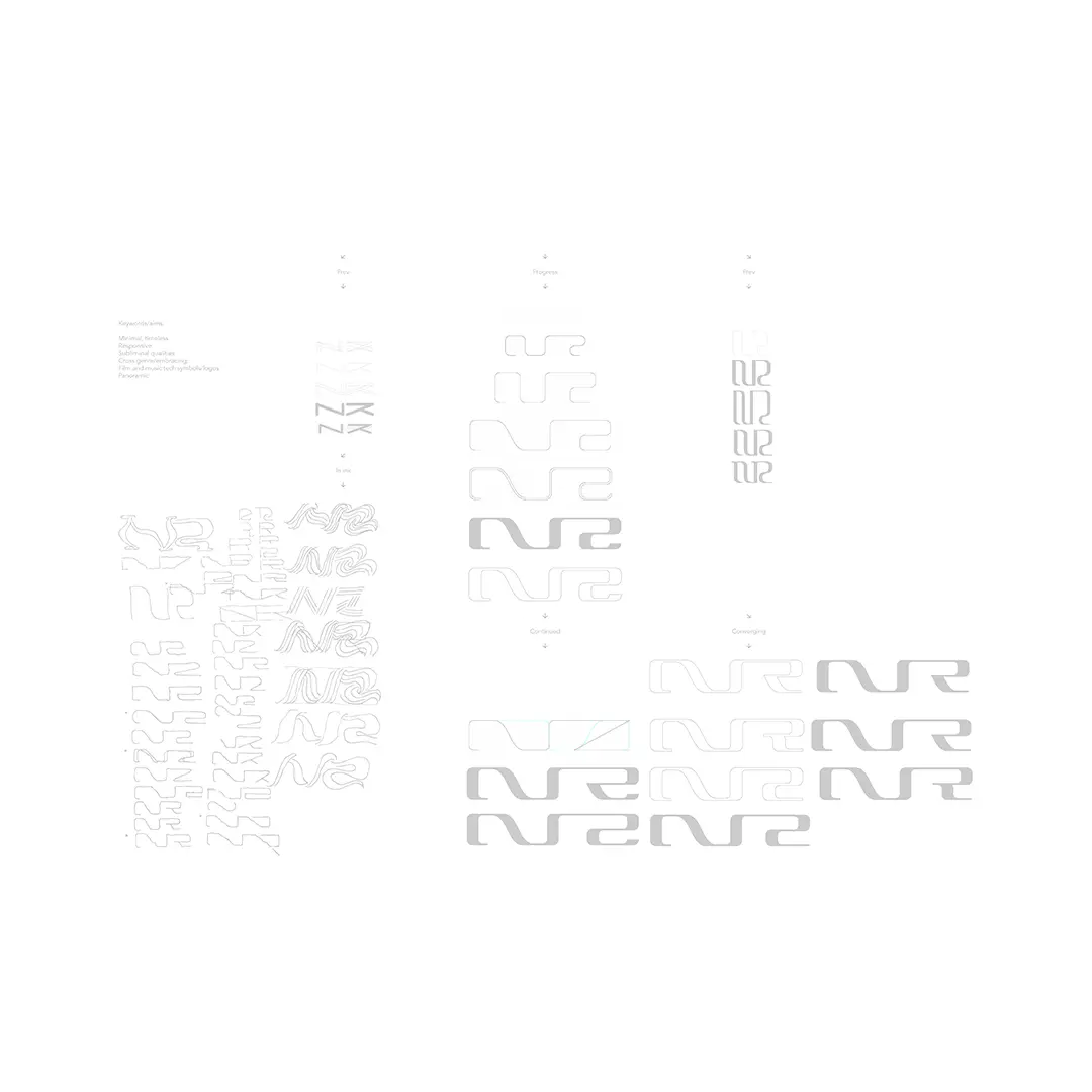
- Fig. 5
- Vectors on screen · Other route
- Fig. 6
- Mixed media on screen · Process overview
Fig. 7
Fig. 8
- Fig. 7
- NR logo · Proportional system (Buratino)
- Fig. 8
- NR logo · Scalability, fill
Fig. 9
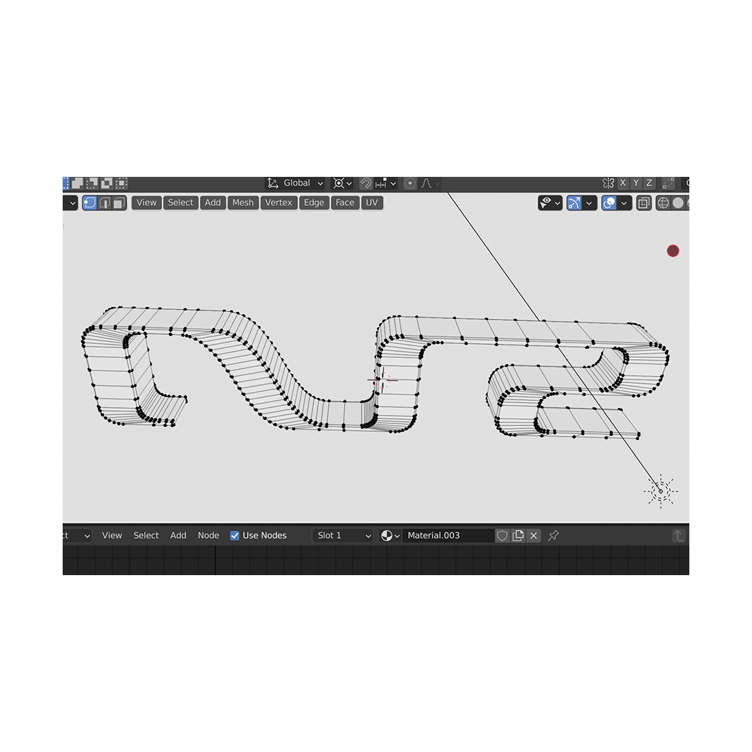
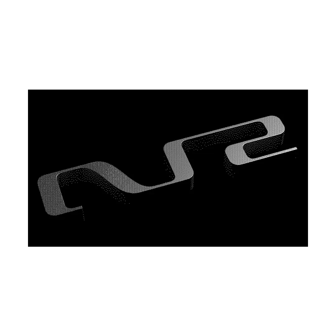
Fig. 10
- Fig. 9
- NR logo · 3D modeling
- Fig. 10
- NR logo · 3D render
Fig. 11
- Fig. 11
- NR logo · 3D version for NR landing page